Horseshoes and Hand Grenades Tattoo
Tattoo studio · homepage redesign
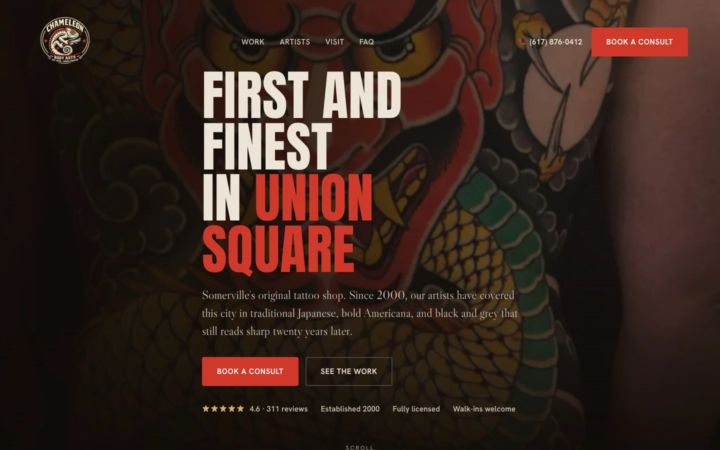
See it →The first and finest shop in Union Square Somerville, open since 2000, whose homepage hid 24 years of award winning work behind a busy neon hexagon background. I rebuilt it to lead with the art.
 Before
After
Before
After
Drag the handle. Left is the original site, right is my redesign.
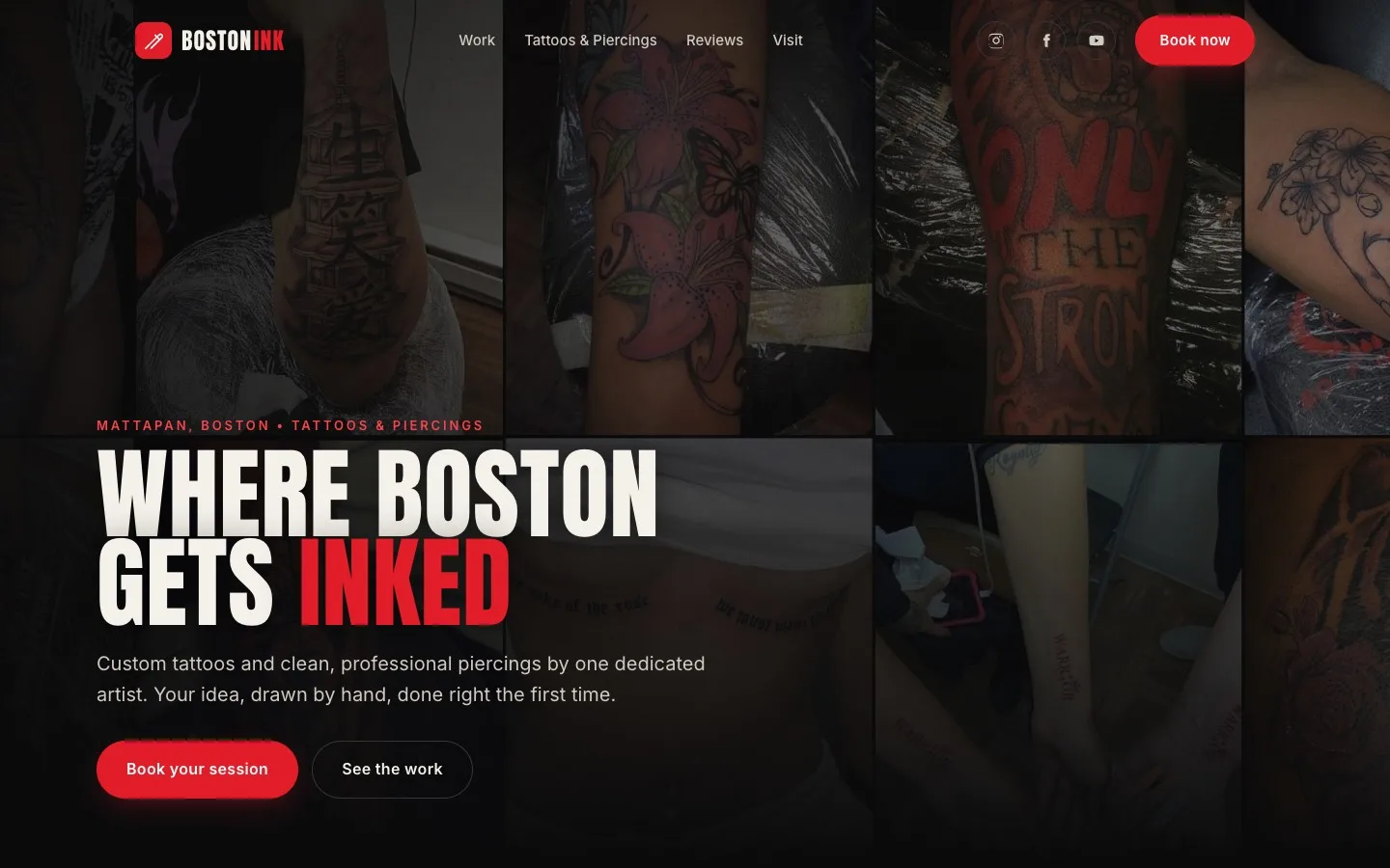
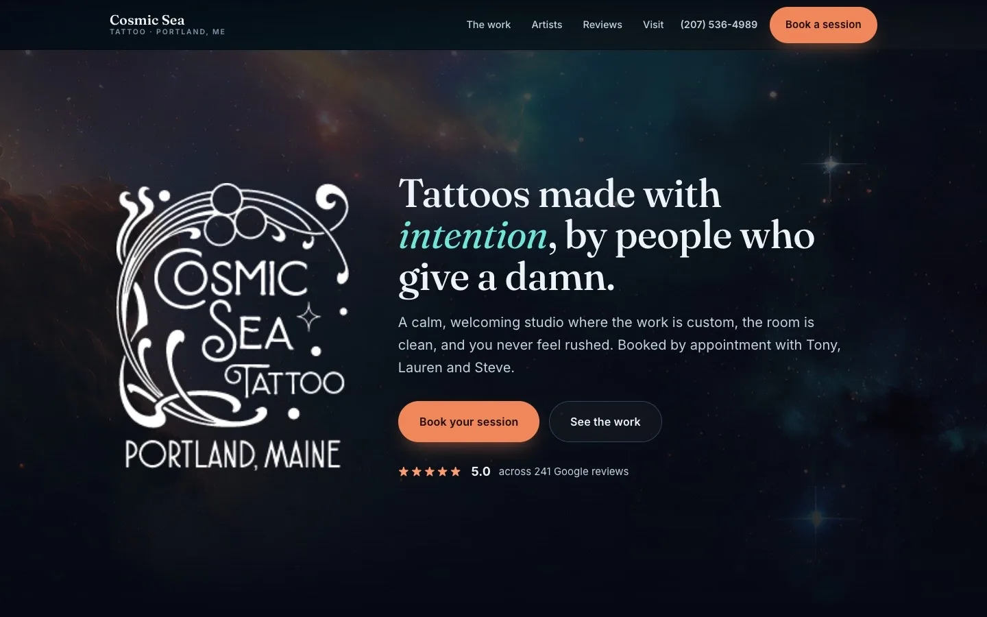
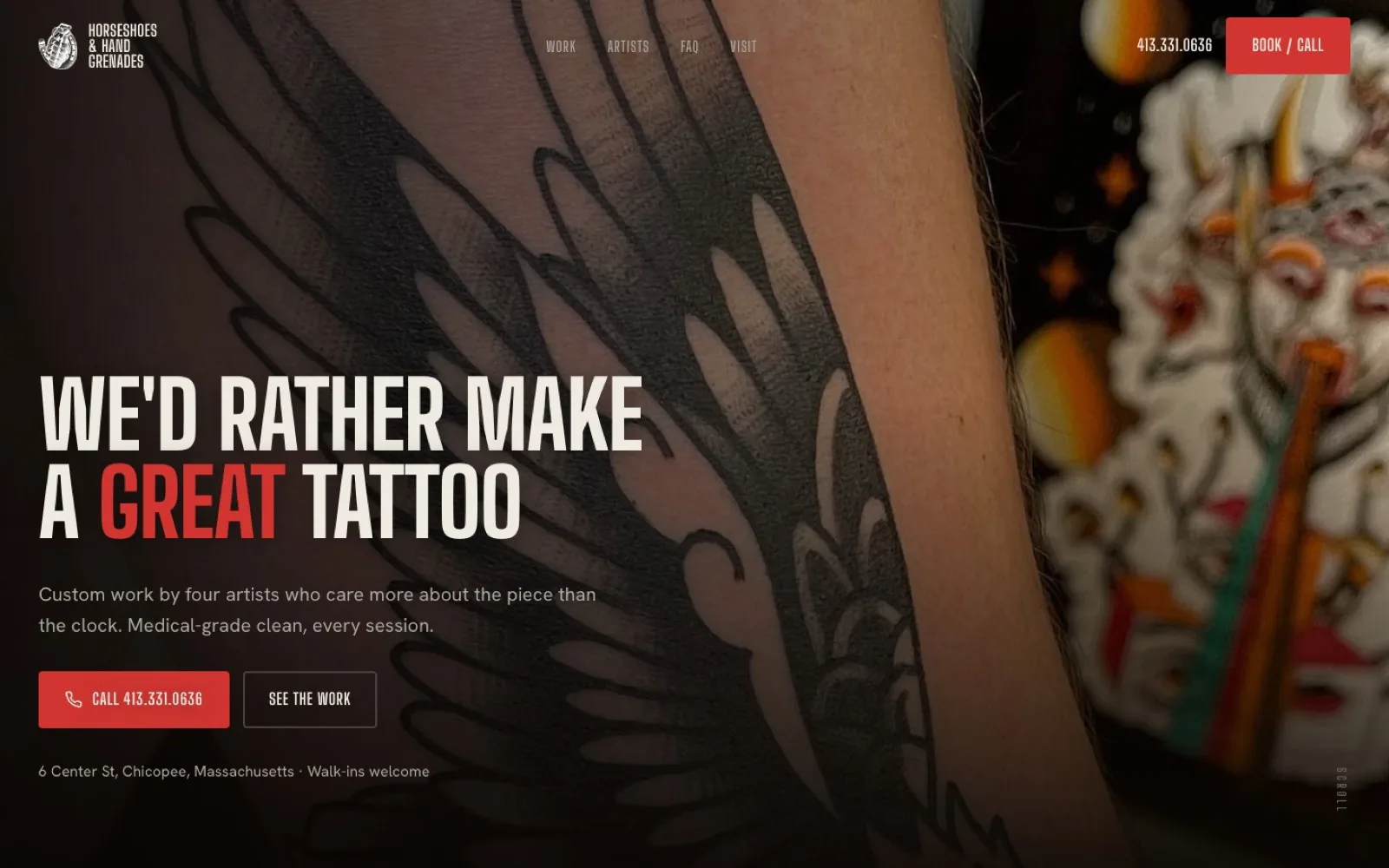
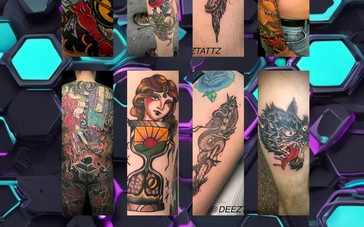
Chameleon Tattoo has been on Union Square in Somerville since 2000, the first and finest fully licensed shop in the neighborhood, with a wall of awards, a 4.6 from 311 reviews, and artists who run from traditional Japanese to classic Americana and realistic black and grey. None of that came through on their homepage. The actual tattoos sat as tiny thumbnails floating on a busy neon hexagon background that fought every photo, so 24 years of strong work looked small and cheap.
I redesigned the homepage on my own, because a shop with that history and that work was showing visitors the least convincing version of itself.
The thing that sells a tattoo studio, the art, was buried under a loud 3D background instead of being the star. There was no clear way to book or even call, just a tiny number up top. The page was a flat wall of thumbnails with no order, so you could not tell who the artists were or what styles they did. The 311 reviews, the awards, and the years open since 2000 were nowhere to be seen. And on a phone, where most people find a shop, it was cramped and hard to read.
I led with a full Japanese backpiece and gave the page a dark, gallery feel so the colorful work is the light in the room, not a neon background. I sorted the tattoos by style and turned the artists into a real roster you can browse, so a visitor can find the right hand for the piece in their head. I put the 4.6 and the 311 reviews and the since 2000 right where you see them in the first second, made the phone tap to call everywhere, and added a clear book a consult button plus a real FAQ about walk-ins, deposits, and aftercare. I also worked their chameleon emblem into a proper logo across the page.
It is built mobile first and made to take someone in Somerville or Boston from "found them" to "booked" in a single visit, because that is where this kind of decision happens.
Same shop, same award winning work, the same 4.6 from 311 people. The redesign just stops hiding it behind the background. If your site is burying what you are best at, these are the tells, and I'm happy to look at yours.
Send me your current site or your idea. I'll tell you straight what I'd change and what it would cost, usually within a day.
Start a project →